As societies strive for long-term mental health solutions, it is essential to address sources of generational trauma and provide intervention and services for marginalized youth and young adults in the child welfare system. In partnership with the non-profit organizations, Health Bridges International and Paths of Hope, and supported by a Jefferson Smart and Healthy Cities grant, Associate Professor Stephen DiDonato of Jefferson College of Nursing and MS Health Communication Design program director and Assistant Provost, Maribeth Kradel-Weitzel of Kanbar College recently travelled to Perú to work with boys living in residential care settings. Using participatory design methods, the boys leveraged their collaborative creativity to promote collective healing and the development of a shared identity through both visual and verbal means.
In a day-long workshop, children and caretakers developed images and narratives for house mascots to represent the identity and spirit of their shared home. Mascots tell a story, add humanity, and are hugely popular around the world. They represent sports teams, schools, geographic regions, corporate brands and more. DiDonato and Kradel-Weitzel trained the caretakers to lead the workshop to support bonding and healthy attachment between caretakers and children. Through co-creation of a house mascot, children developed an increased sense of unity among one another and caregivers and were empowered to recognize their creative output as valuable.
DiDonato and Kradel-Weitzel will assess measurable impact of this pilot regarding both the initial mascot development workshop and longer-term implementation of the mascot within the homes. This effort resides within a larger initiative to develop a Global Center of Excellence for Child Welfare Services.
Posters Against Ebola is a response to the most recent and largest Ebola epidemic in history. This deadly disease is surrounded by many controversies, locally and globally. Posters Against Ebola provided a place for designers, artists, and activists to express ideas, solutions, and opinions about this disease and the human reaction to it. All proceeds from the sale of the editions of 53 unique posters included in the collection go to Doctors Without Borders. The work can be seen and purchased at postersagainstebola.com and is available for exhibit. Shown are images of the catalog, my personal poster contributions and an exhibit of the work at SPACE gallery in Philadelphia.
Please read PRINT Magazine's interview about this project here.
Here is a quick look at some identity work done by Kradel Design.
Founded in 1991, Design Science was one of the first consultancies to focus on the person-product interface. The company is composed of design scientists with backgrounds in human factors, cognitive psychology, industrial design, information systems, medicine, and anthropology. Design Science is dedicated to improving the quality of peoples’ lives through the skilled application of human factors engineering and ethnographic research.
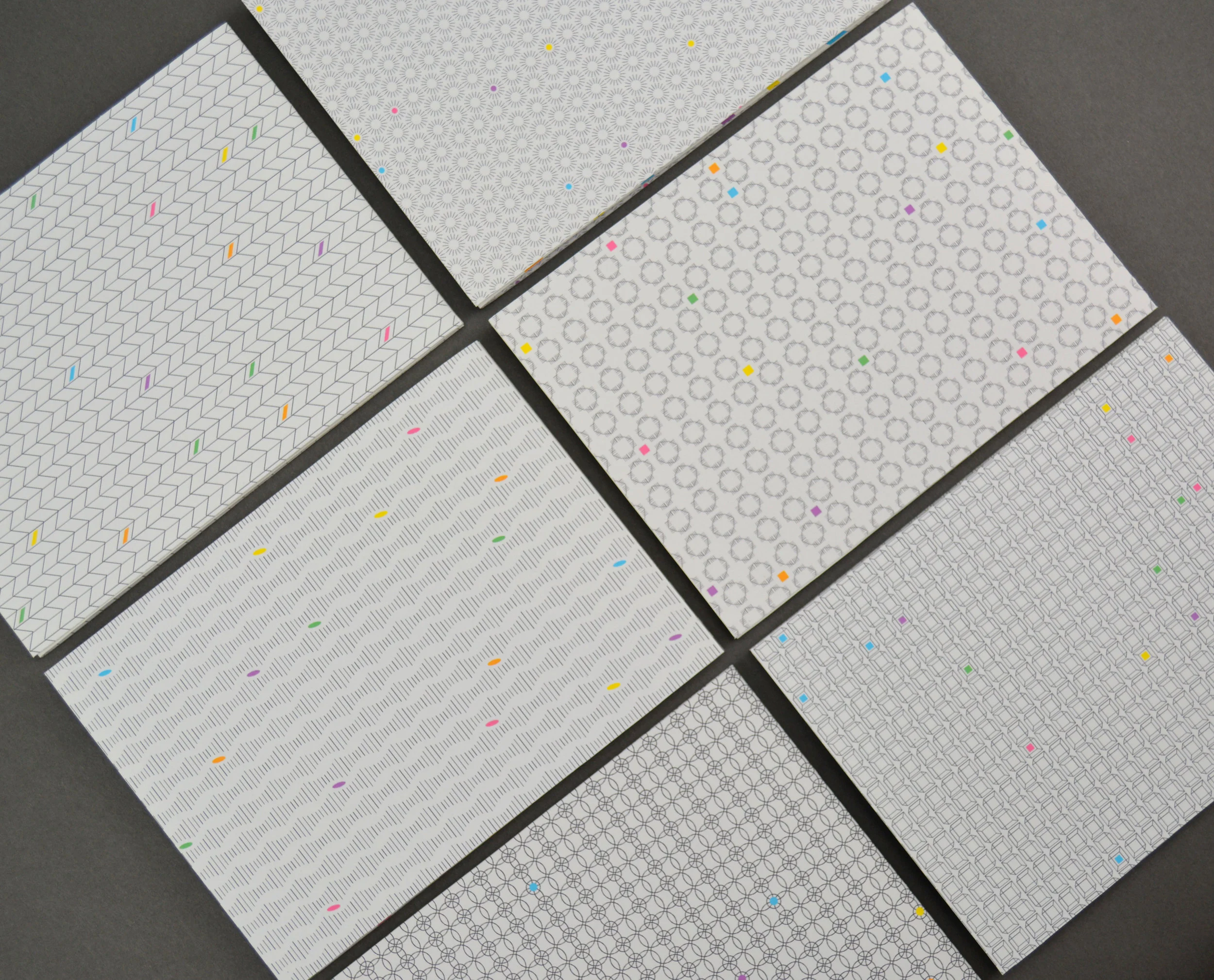
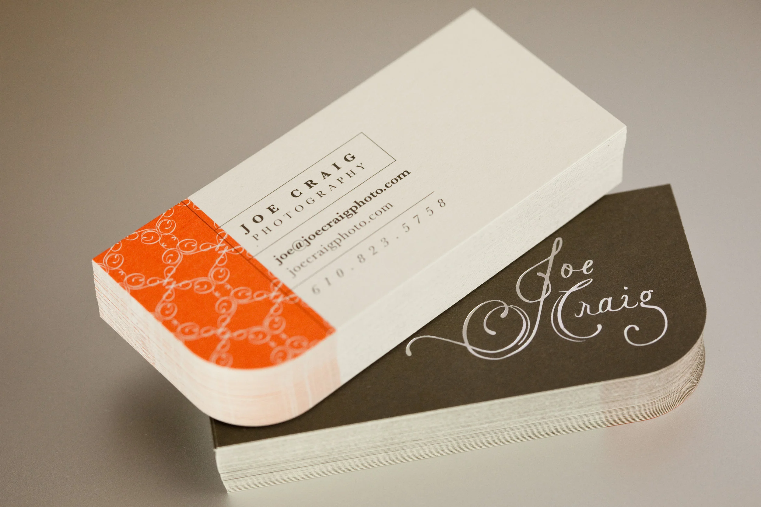
The existing mark focused on representing the difference between design and science whereas the new mark both respects their differences and amplifies their connection. It is an image that represents both something molecular and something reminiscent of childhood play and discovery such as a tinker toy or jacks. It encourages the viewer to simultaneously hold two thoughts in his or her mind—what is functional and what is human as we strive for the advancement of healthcare technology.
The process involved intensive research of marketplace competitors, a visual audit, stakeholder interviews and close client to designer communication through an iterative visual exploratory process that included examination of how the mark would live in different environments, scales and color situations.
Chosen mark in vertical and horizontal formats, dark and light backgrounds, favicon and a sample pattern.
A history of the Design Science identity.
An alternate concept: Design Science crosses disciplinary boundaries with ease as is reflected in this conversational visual.
Alternate concept dynamic options showing how the mark could change for different purposes such as invoices, estimates, directional signage, holiday invitations, etc.
Alternate concept environmental proposal. The typography reads: “Do I have something in my teeth?”
Alternate concept exploratory studies.
An alternate concept that uses typographic forms to convey the overlap between the knowledge spheres of science and design.
Alternate concept dynamic color studies. The overlap area produces a color that is a surprising result—the complementary color of the “D” color, rather than a mixture of the two colors within the “D” and “S.” Combining “design” and “science” results in something greater than the sum of its parts.
The scratchboard medium requires drawing backwards—drawing the light instead of the shadow. The pieces shown include a series of Victorian era circus imagery and a functioning clock based on the story, Cinderella. The clock features a pendulum with the glass slipper that the two evil step-sisters fight over as it swings back and forth.
As a member of the collaborative studio, 705 West, I have been creating images for a variety of assignments and personal explorations using the drypoint technique. Some images involve intaglio inking, chine-collé and other media.
Created for Pearson Press, Disrupt Together is about the tight linkages between innovation and opportunity recognition. It covers many aspects of design thinking and teamwork as key factors in disruptive innovation.
I received a Sappi Ideas That Matter grant to assist a local organization that supports arts programs in underfunded schools through financial aid and arts programming. The organization reproduces children’s art at a large scale, sells those reproductions to corporations and uses the earnings to support its mission. With these funds, I created promotional designs and bilingual materials that helped children and their parents to understand what it means to allow their art to be used for this purpose.
This page showcases a collection of posters promoting various events and causes.
* Designer, Activist, Woman—a panel discussion for Jefferson University featuring women using their design skills for political and social purposes.
* Wear Your Voice—promotional piece for a t-shirt design competition for students sponsored by AIGA Philadelphia and Adobe. The letters were applied to fabric, then folded and photographed.
*Migratory Pattern of the Designer—announcement poster for a spring lecture series at Philadelphia University highlighting the global origins and influences of the speakers.
* Original Champions of Design—lecture poster illustrating the working process of the two principals. Front, back and detail images are shown. This poster displays an experimental illustration style that translates traditional cross-hatching into vector art.
* The Design of Equality—lecture poster and banner for an event featuring Emory Douglas (Minister of Culture for the Black Panther Party) with an introductory presentation by Kelly Holohan (LGBT activist and designer).
* The Hurricane Poster Project—a response to Hurricane Katrina sold as part of a collection of posters with all proceeds going to The Red Cross.
This was a thank you gift from Philadelphia University (now Jefferson University) to high-end donors. The scarves were hand-done using "ebru"—a 15th century Turkish technique for dyeing silk. The packages were laser cut with a Turkish pattern, and, since each scarf was unique, allowed the viewer to see the colors of the scarf inside without opening the package.
Various examples of pen and ink illustration for children's focused projects.
In collaboration with writer, James Murphy, Kradel Design created a series of 6 birthday cards for Einstein Healthcare Network. These cards would be sent to Einstein employees on their birthdays to encourage them to take advantage of the LiveWell program. LiveWell's purpose is to support employees' health and well-being through better management and prevention of chronic conditions.
Cards were designed to target specific age groups. Each card is a three panel accordion fold with a unique pattern on the back.